As more organizations move to a hybrid workplace, the focus is on helping employees adapt to new ways of working. A hybrid work environment, more than ever, calls for employee-centric intranets because there isn’t always someone to tap on a shoulder and ask for help.
Employee-centric intranet requires room for frequent but non-distracting communication, easy-to-find forms, processes, and documents, self-service tools, and anytime/anywhere onboarding and learning.
Here are trends that shape intranet design best practices in 2023 to enable employee-centric intranets.
Intranet Content Organization
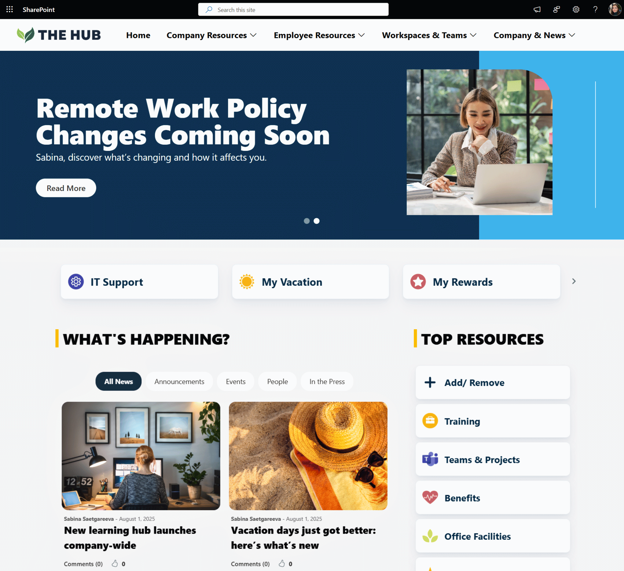
1. Website-like news carousel
For years, companies used a top section of their intranet homepage to promote multiple news at once. This made the top of the page look more like a dashboard which was hard to read.
Too many choices created a distraction and not enough attention span.
Employees now expect their intranet to be like an internal website they can scroll through, not a dashboard they have opened at all times.
Website-like news carousel looks cleaner, and lets employees focus.
In addition to news, employees can easily access the resources and links needed to do their work.
Example of the website-like news carousel on an intranet
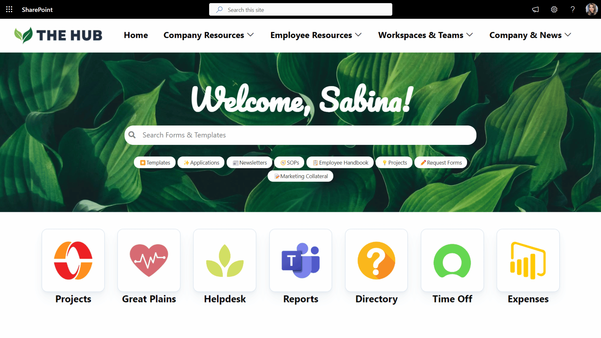
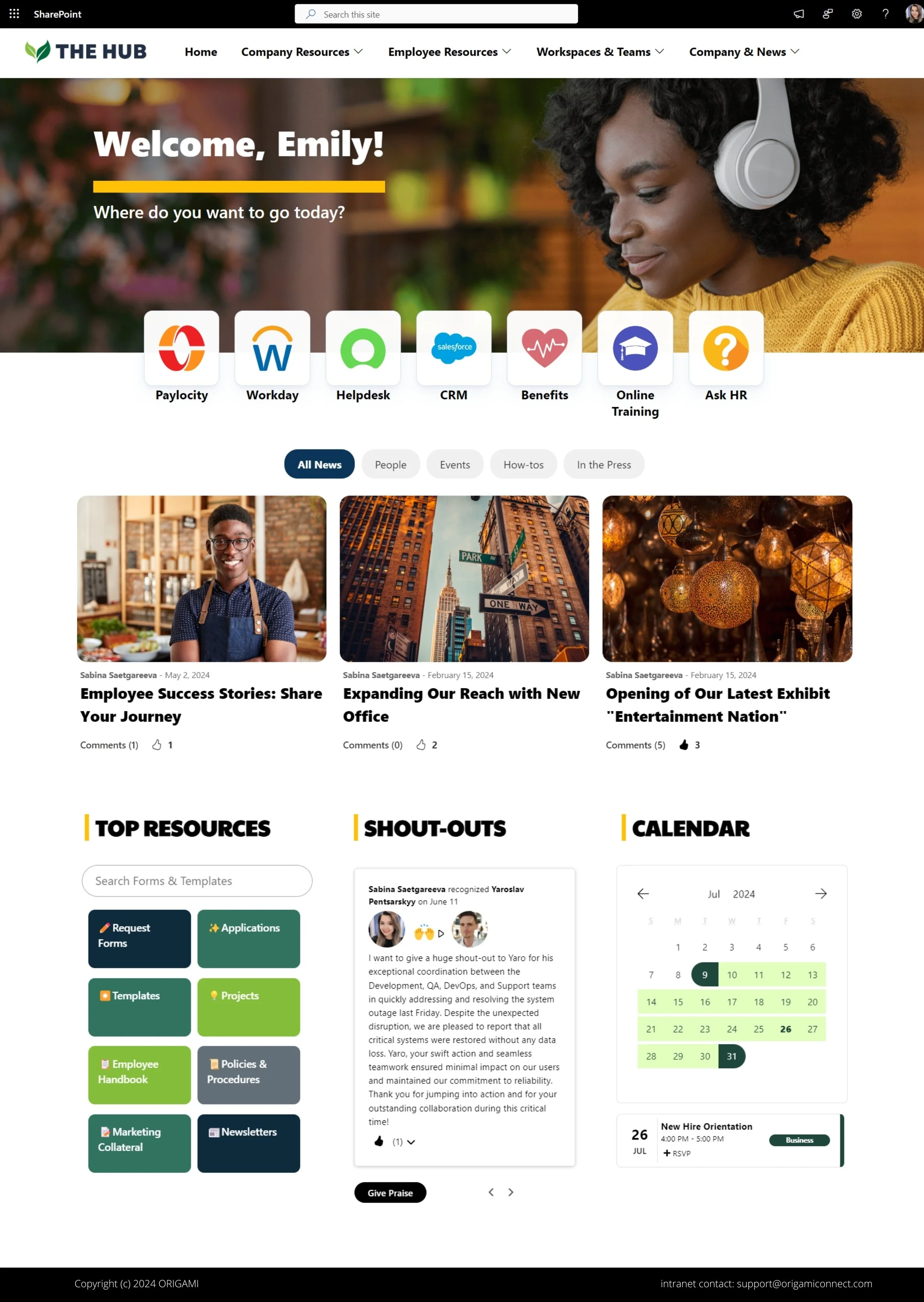
2. Personalized content
According to a 2022 study on Organizational Psychology, when readers are bombarded with too much content, they often choose to avoid a publisher altogether. And that’s not what you want from your intranet!
This especially became a trend in the post-pandemic era.
A solution is to personalize and show content relevant to different groups of employees.
Targeted content will keep employees on a page and improve intranet engagement.
A few ways to personalize your page:
Design intranets with targeted quick links, and bookmarks
Add personal welcomes, even if the rest of the page is still general
Add role-specific, permission-driven content (see example below)
3. Content chunking lists and progress bars
How often do you see an intranet page with nothing but a 1000-word policy?
It’s hard to read.
And our own page analytics show that intranet users scroll past the wall of text.
The solution is to chunk content into:
Collapsible sections
Progress lists
Checklists
Simple graphics
This will help break information into digestible chunks and highlight essential parts employees might be looking for.
In the example below, the collapsible and progress lists help new hires navigate the onboarding process. You can also use collapsible lists to break up long policy documents.
The progress lists are great for helping to show timelines and complex processes.
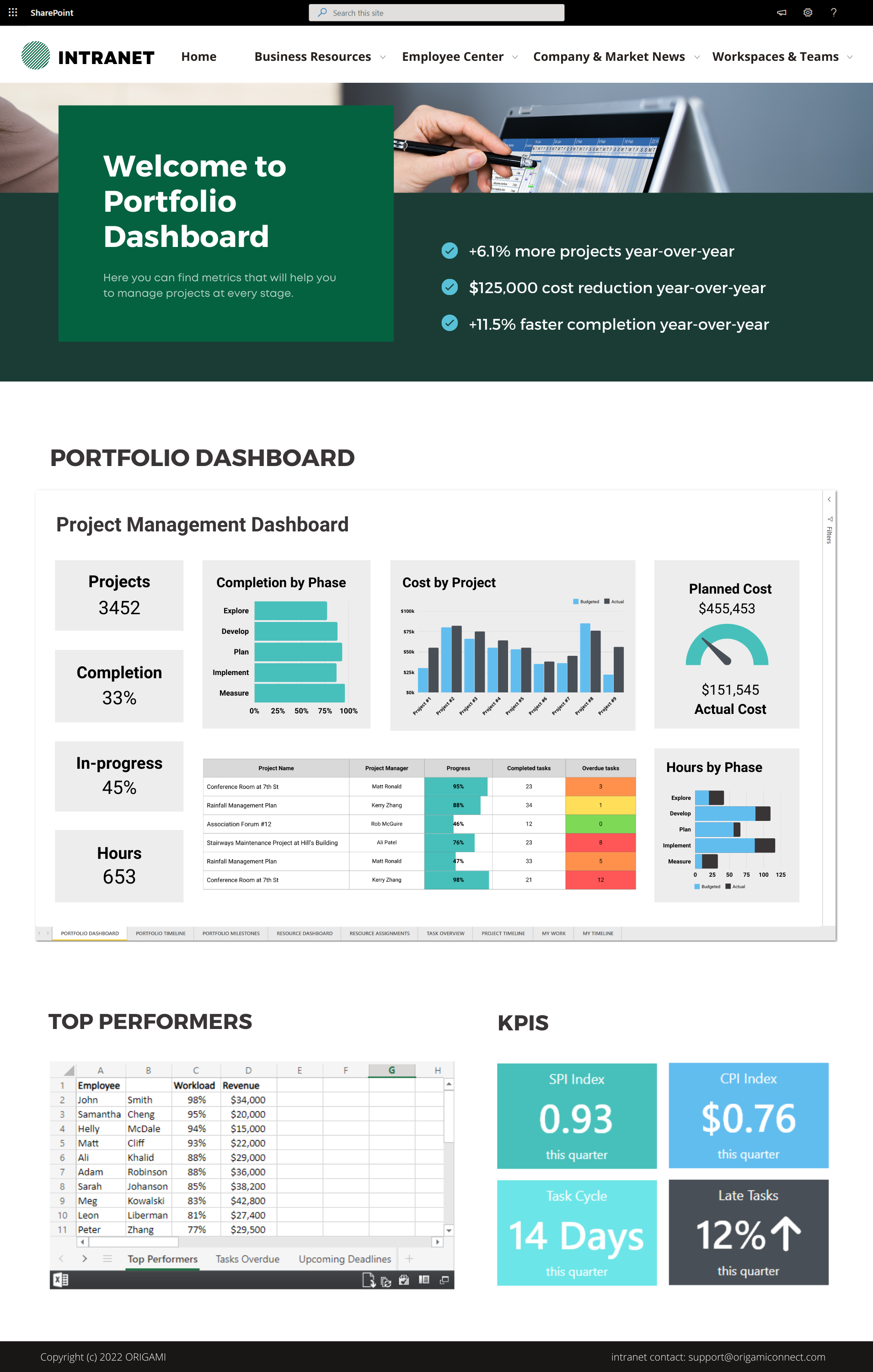
4. Data Visualizations
Working remotely these days, employees can be so focused on their own bubble of tasks that they risk losing touch with the overall company direction.
How do you keep a large workforce aligned with the rest of the company’s goals?
The solution: choose a set of key business metrics and show them consistently on your company intranet homepage.
Here is how you can keep employees in the know about how the company is doing:
Performance dashboards
Milestone trackers
Charts
Tickers
Even a simple KPI like you see below can keep employees updated with the company’s performance metrics (real-time if data is available).
This simple solution can help remind employees about what the organization is working towards.
The best place for this type of display is right on the intranet homepage next to the company-wide news.
Intranet UI trends for 2022/23
More users are now accessing intranets from their phones or tablets as they work from the comfort of their homes.
To look consistent, enterprise applications have started to adopt the UI trends from these mobile devices.
Microsoft applications, including Microsoft 365, already follow this trend, and your intranet is no exception.
Here are the new 2022/23 UI trends to be aware of.
5. Rounded shapes
Rounded shapes for images, page web parts, and other elements make the look and feel of the page more consistent and appealing to users.
With rounded corners, news posts and resource pages look like buttons, encouraging users to take action. Also, compared to a squared design, an intranet with round shapes looks warmer and friendlier to users. Softer edges are known to be psychologically associated with something safe.
See the example below for reference.
Example of rounded design on an intranet
6. Flat Design
The flat design means web parts and page elements don’t have shadows and a third dimension. This makes page elements look cleaner, simpler, and clutter-free.
Compared to a 3D-like material design, a flat design brings solid colors, clear fonts, and a 2d look. This makes the page load faster and more consistent with mobile phones and tablets.
See the example below that shows how a flat design looks.
Intranet design example with a flat design header
Intranet Design Process
UI design is the most obvious and distinct feature; like the cover of the book, people will judge it first.
The less obvious is how you make it so employees keep coming to your site daily!
Here is how you do it.
Make intranet search and navigation easy
Poor navigation and search are the most complained about intranet features.
You know it, we know it, and your employees know it.
To make your navigation and search intuitive you need to build an effective information architecture (IA) for your intranet. IA is like an intranet Search Engine Optimization that makes your intranet search much more effective and your site more intuitive.
Here is a high-level summary of what that process involves.
Involve your employee in making decisions
Employees care more about the systems they helped to build.
Fortunately, involving users doesn’t have to be chaotic.
We routinely involve employees during information architecture and visual design, and the whole process is tight and structured.
Take a look at how we collect valuable feedback on a visual design.
Listen to feedback and improve
Improvement is critical to sustaining adoption.
If you listen to your users’ feedback and prioritize improvements – your intranet will evolve in the direction of greater usability and therefore be adopted better.
You can use simple employee surveys to get feedback.
Our secret sauce is using a data-driven approach to feedback by measuring employee behaviors right within the page. See what this looks like.
Putting It All Together
To help you visualize how you can use these tips for your intranet design, here are the examples of intranet pages we’ve created with these best practices in mind.

Sabina Saetgareeva is a Digital Marketing Specialist at ORIGAMI. She helps infuse ORIGAMI brand with what customers need and seek. Sabina is an avid reader of the future of work, digital transformation, and trends in Digital Employee Experience.


Get inspired with six company intranet examples built on data collected from hundreds of intranet sites. See intranet best practices and design ideas to help you build an intranet employees will love.