“Wait… this is our intranet?”
That’s what Sarah thought the moment she landed on the new homepage.
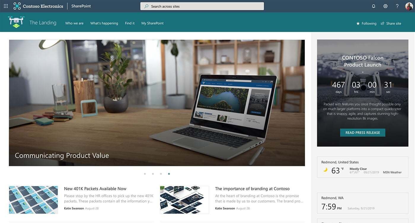
Technically, everything was there. The links worked. The documents were accessible. But something felt off. It didn’t feel modern. Or intuitive. It felt like a tool built for IT—not for her.
Grey. Boxy. Confusing.
And Sarah wasn’t the only one. Within the first week, the internal comms team was flooded with feedback like:
“It’s hard to find anything.”
“Can we make it look less corporate?”
“Why doesn’t this feel like our public website?”
That’s when the team realized something important: SharePoint can be powerful—but out of the box, it doesn’t deliver the polished, modern experience employees expect.
The good news? You don’t need to redesign everything from scratch or bring in developers. With a few smart adjustments and the right tools, you can turn your SharePoint site into something that actually feels like a website.
Here’s how.
Make Your SharePoint Site Look Like a Website
1) Use Communication Sites
If your SharePoint site feels cramped or cluttered, the layout could be to blame.
Team Sites are great for collaboration, but they’re not designed with website-like aesthetics in mind. You’re stuck with a bulky left-hand menu, a narrow main section — and as you zoom out, all that white space on the sides starts to take over.
The result? A page that feels tight in the middle and empty around the edges — not exactly the clean, website look you’re going for.

So, what should you do instead?
Use a Communication Site as your foundation.

You’ll get:
A full-width layout
Less clutter from left-hand navigation
A layout that actually feels like a proper website
It’s a small change that makes a big difference in how your site looks and reads.
2) add Your Company Fonts, Colors, and Icons
One reason SharePoint pages often feel generic is because they all kind of look the same. Same fonts. Same colors. Same layout.
While SharePoint does offer some theming options, there’s only so much you can tweak when it comes to text styles, buttons, or link appearance.
One way to make your site look less generic is by adding your brand’s fonts and colors. You can upload your company fonts through SharePoint Brand Center, and use tools like Origami web parts for more design flexibility.
Here are some simple ideas:
Use custom headings to welcome intranet users to the site
Add quick links with branded icons and hover effects
Use background images with your company colors
It’s a simple way to make your site feel more polished — and more like it belongs to your organization.
3) Give Your SharePoint Navigation a Website Feel
Page navigation still ranks as the number one way people find their way around a SharePoint site, so it needs to be prominent and simple to use.
SharePoint’s built-in navigation does the basics. You can add a logo, change the theme color and even set up a mega menu. But let’s be honest, it still doesn’t feel like a real website. It works, but it’s not exactly sleek or flexible.

That’s where Origami’s Navigation web part makes a big difference.

You can:
Customize colors and fonts to match your brand
Adjust the size of your company logo
Add multi-level dropdowns and link descriptions for better clarity
It’s fast, it’s visual, and it actually looks like the kind of navigation users expect from a modern site, not just another internal portal.
4) Add a Personal Touch
Default SharePoint pages are the same for everyone. They work, but they don’t feel personal or tailored.
For example, there’s no easy way for users to add their own bookmarks or even see a friendly “Hi, Sarah!” at the top of the page.
Origami changes that.

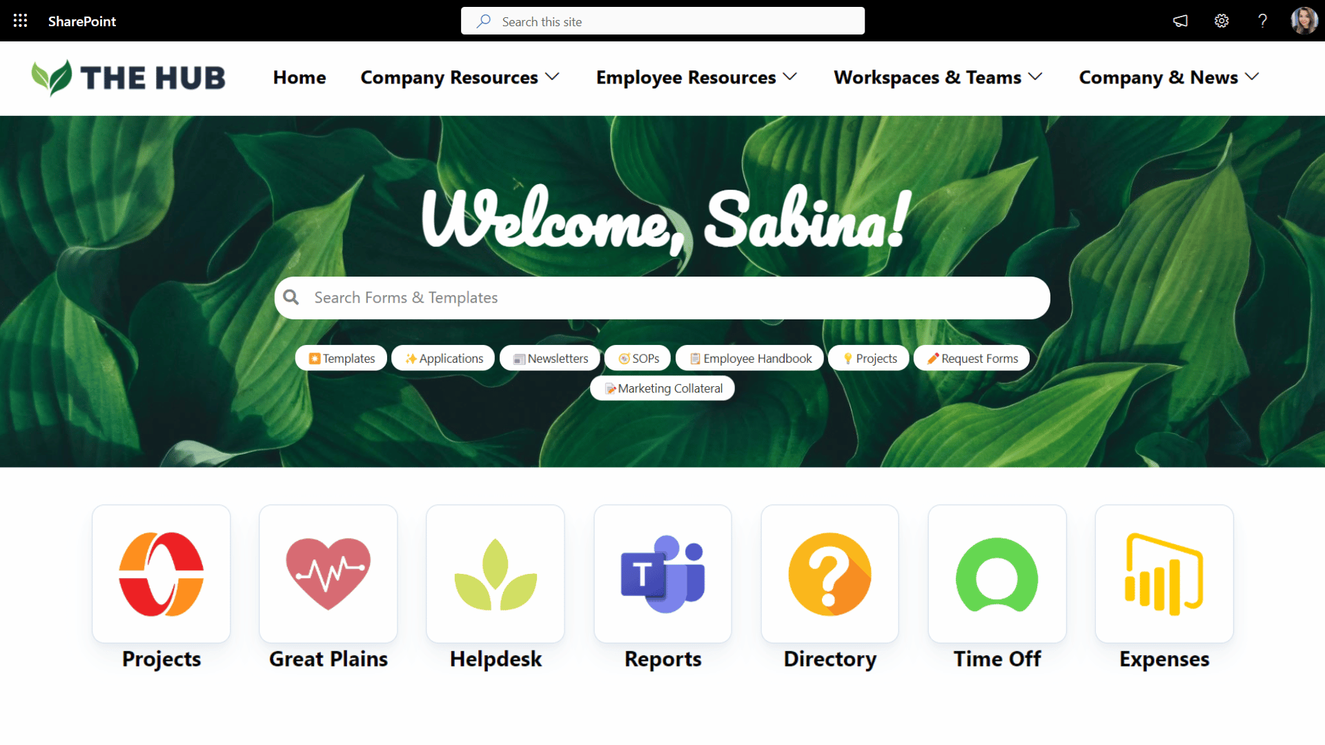
Example of a SharePoint Homepage with Personalized Quick Links
With just a few clicks, you can:
Greet users by name with a personal welcome
Let employees pin their own quick links
Show different content based on someone’s role or department
These small touches make a big difference. Suddenly, your SharePoint site doesn’t just look better, it feels like it was made for your team, not just by your team.
5) Use video banners and animated quick links
One of the easiest ways to make your SharePoint site feel alive like a modern website is by adding a video. Just look at this top banner and these quick links that play video on hover:
It feels modern, interactive, and like something you’d expect in 2025.
Trying to recreate that with standard SharePoint web parts? Not so easy.
But with the Origami Video web part, it’s a completely different experience. I can upload a video directly, choose the size and layout that fits the page, and even set it to play automatically when someone hovers over it—just like you see here. It’s super flexible, easy to use, and the results look fantastic.
6) Visualize Your Lists and Document Libraries
SharePoint Lists and Document Libraries are super useful, but let’s be honest, they’re not exactly easy on the eyes. Everything looks the same, there’s no visual hierarchy, and it takes way too long to find what you need.
Origami helps you bring that content to life with clean, user-friendly layouts:
Finder web part: Displays your document libraries in a visual format with branded colors, previews, and easy search

Progress Timeline web part: Turns a SharePoint list into a clean, interactive timeline—perfect for onboarding steps, training flows, or process tracking
Anniversaries web part: Automatically shows employee birthdays and milestones from Entra ID with names, photos, and a warm, celebratory feel.

Instead of users digging through dense tables or flat lists, they get a visual experience that’s easy to scan and take action on—just like they’d expect from a modern website.
7) Reuse What Works
Here’s something that trips up a lot of SharePoint designers: you create a page that looks great… and then realize you can’t reuse it on another site. There’s no easy way to copy layouts across your intranet. So, you rebuild. Again. And again.
That’s not how modern websites work—and it doesn’t have to be how your intranet works either.
Origami gives you:
A page copy tool that lets you duplicate entire pages—even across different SharePoint sites
Pre-built templates for common intranet pages, so you’re never starting from a blank canvas
Full compatibility with native SharePoint elements, so you can mix and match with confidence
It’s a smarter, faster way to build — and it keeps your design consistent, no matter how many teams or departments you’re supporting.
Make your SharePoint look like a website with Origami Web Parts
SharePoint gives you the basics—but if you want your intranet to feel like a modern, branded website, you need more design control than it offers out of the box.
That’s where Origami adds value.
Whether it’s personalized quick links, visual document libraries, animated banners, or pre-built templates, Origami web parts give you the flexibility to design pages that look great, feel personal, and work the way your team want —all without writing a single line of code.

And because Origami is built right on top of Microsoft’s own SharePoint framework, it stays stable, even when Microsoft rolls out updates.
So instead of fighting against SharePoint’s limitations, you can finally build an intranet that’s clean, engaging, and truly website-worthy.
Ready to make it happen?
Origami makes your SharePoint site look and feel like the website it was always meant to be!

Sabina Saetgareeva is a Digital Marketing Specialist at ORIGAMI. She helps infuse ORIGAMI brand with what customers need and seek. Sabina is an avid reader of the future of work, digital transformation, and trends in Digital Employee Experience.