If you’ve ever opened a default SharePoint homepage and thought, “This could look way better,” you’re not alone.
In this guide, I’ll walk you through a complete SharePoint page design makeover, showing you how to create a SharePoint page that’s modern, functional, and actually something employees want to use.
Whether you’re building a SharePoint landing page for your whole organization or improving a team site, these best practices will help you transform any SharePoint page from bland to brilliant.
For even more inspiration, see SharePoint intranet examples below.
Before: The Out-of-the-Box Layout
The original SharePoint homepage we started with had three big issues:
A cluttered right-hand column packed with widgets.
Too much white space on the sides.
A huge static grey banner at the top — generic, hard to read, and with no clear purpose. Was it meant for featured announcements? A page header? Something else entirely? No one could tell.
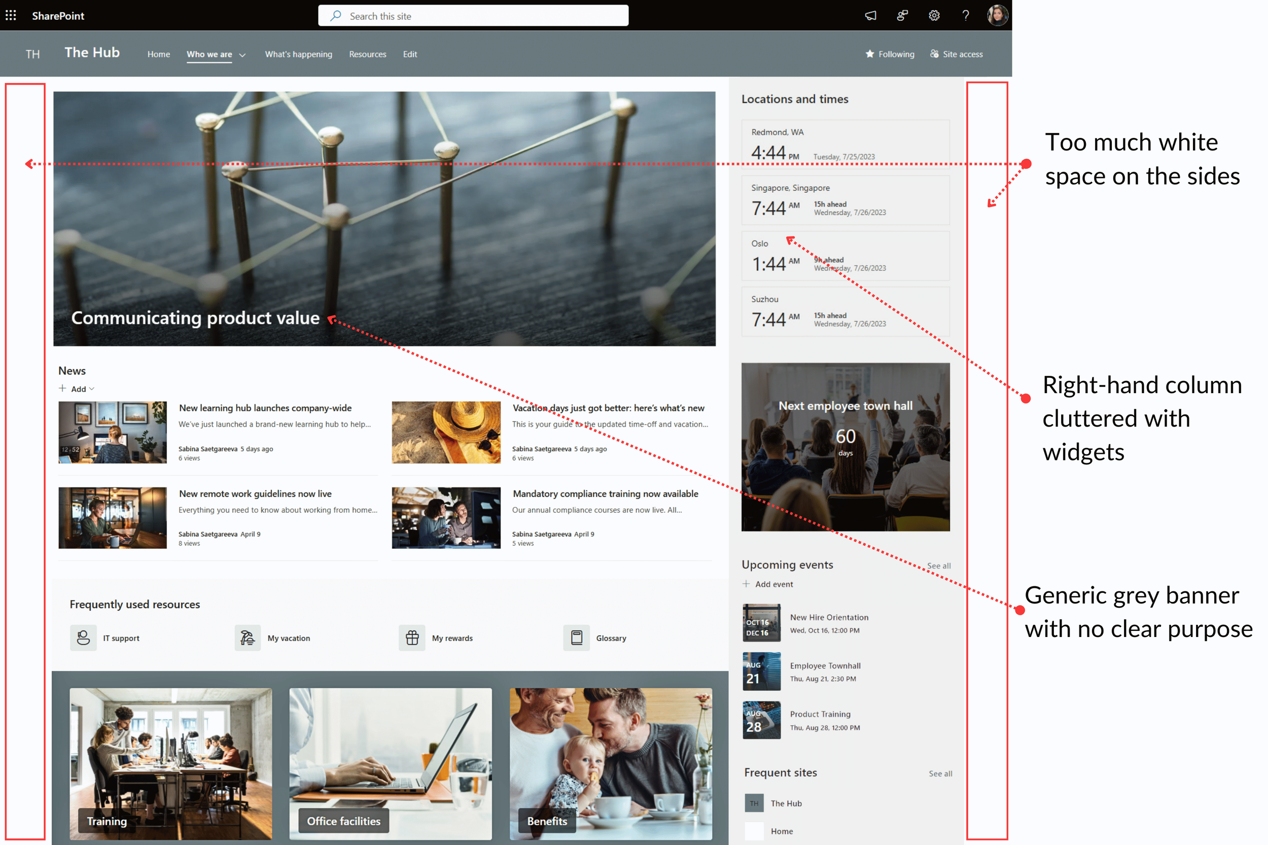
The main body of the page had white space, but the sidebar looked like a messy closet. It was visually overwhelming and didn’t help people find what they needed.
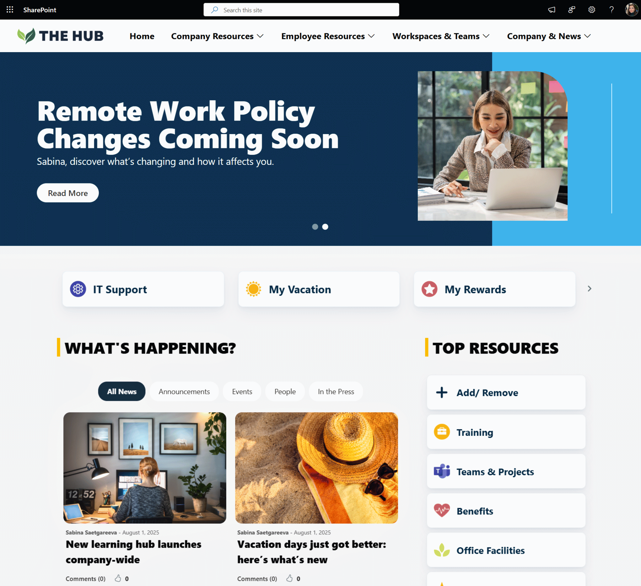
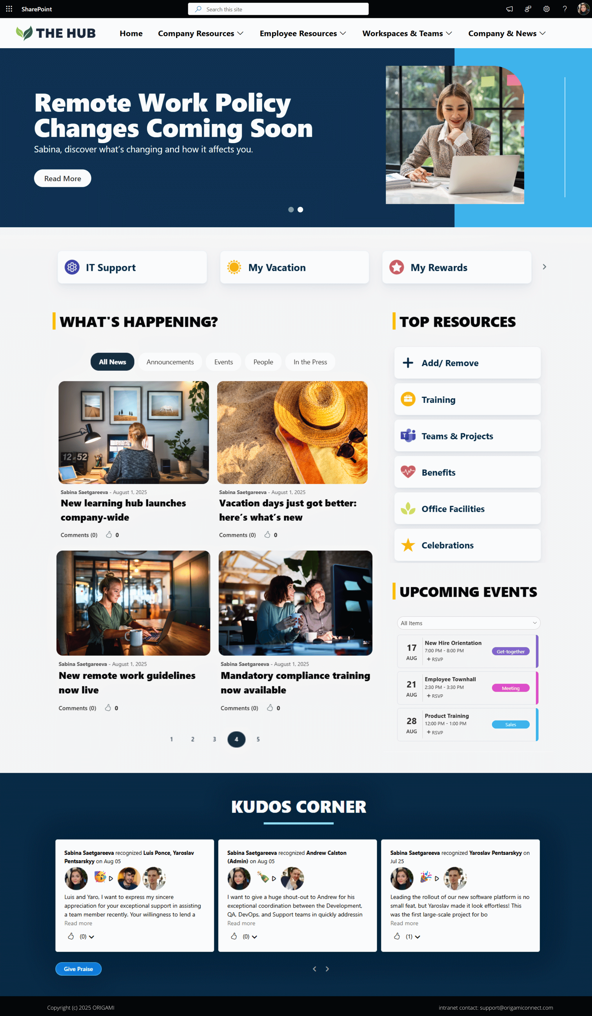
Step 1: Transforming the SharePoint Homepage Banner Area
When creating a SharePoint page that draws people in, the top section is critical. It’s the first thing users see, and you never get a second chance to make a first impression.
That’s why we replaced the grey banner with a full-width Origami News Carousel.
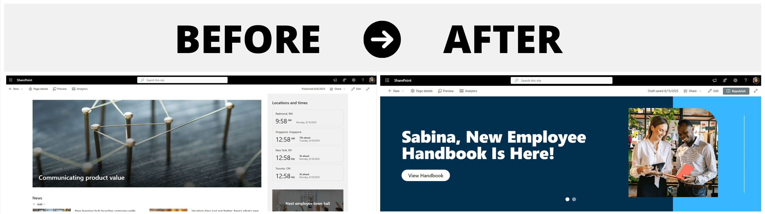
Now, the top of the SharePoint homepage:
Greets each user by name.
Showcases branded imagery.
Features bold headlines with clear calls to action.
What was once wasted space is now a go-to spot for important announcements.
For more SharePoint homepage design tips, check out 4 Key Elements of a Great Intranet Homepage.
Step 2: Clearing Out Clutter for a Better SharePoint Page Design
The right-hand column was overloaded, so we removed what people didn’t need every day:
World clock – handy for scheduling meetings, but not something most people check from the homepage.
Countdown timer – quick to become outdated and better replaced with the events web part.
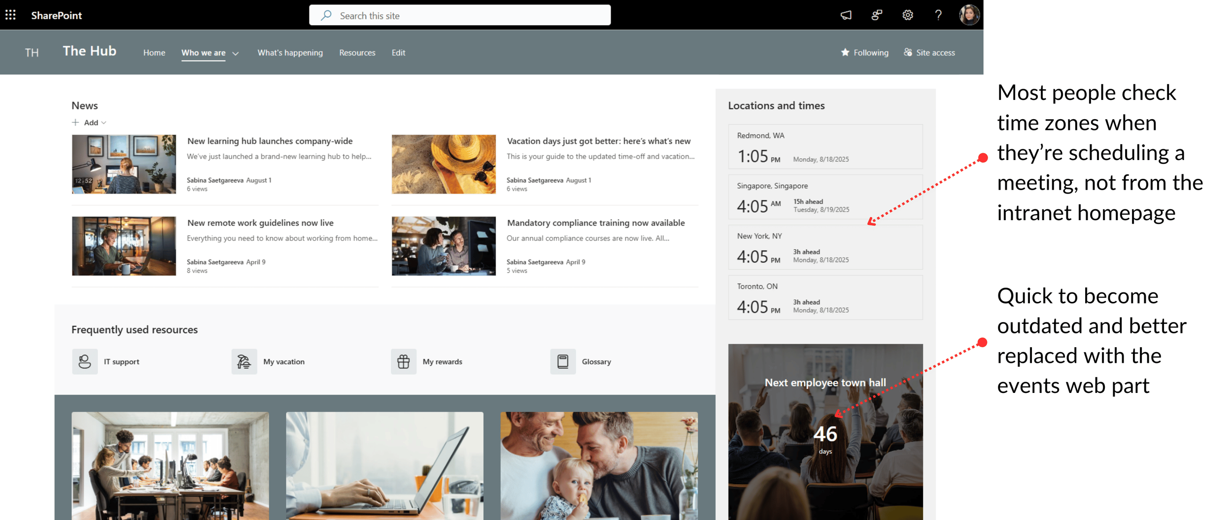
We kept upcoming events and frequent sites but moved them aside while we worked on a cleaner, more user-friendly layout.
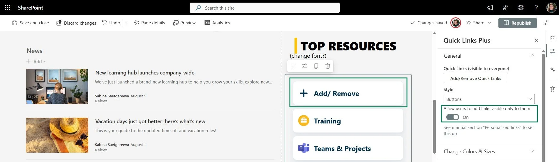
Step 3: Redesigning Quick Links on a SharePoint Landing Page
Quick Links are one of the most important parts of a SharePoint landing page, but here they were buried below the news section and split into two different styles.
To fix this, we:
Moved them up where they’re easy to see.
Combined them into a single, consistent design using the Origami Quick Links web part — clean, modern cards with icons, soft shadows, and clear labels.
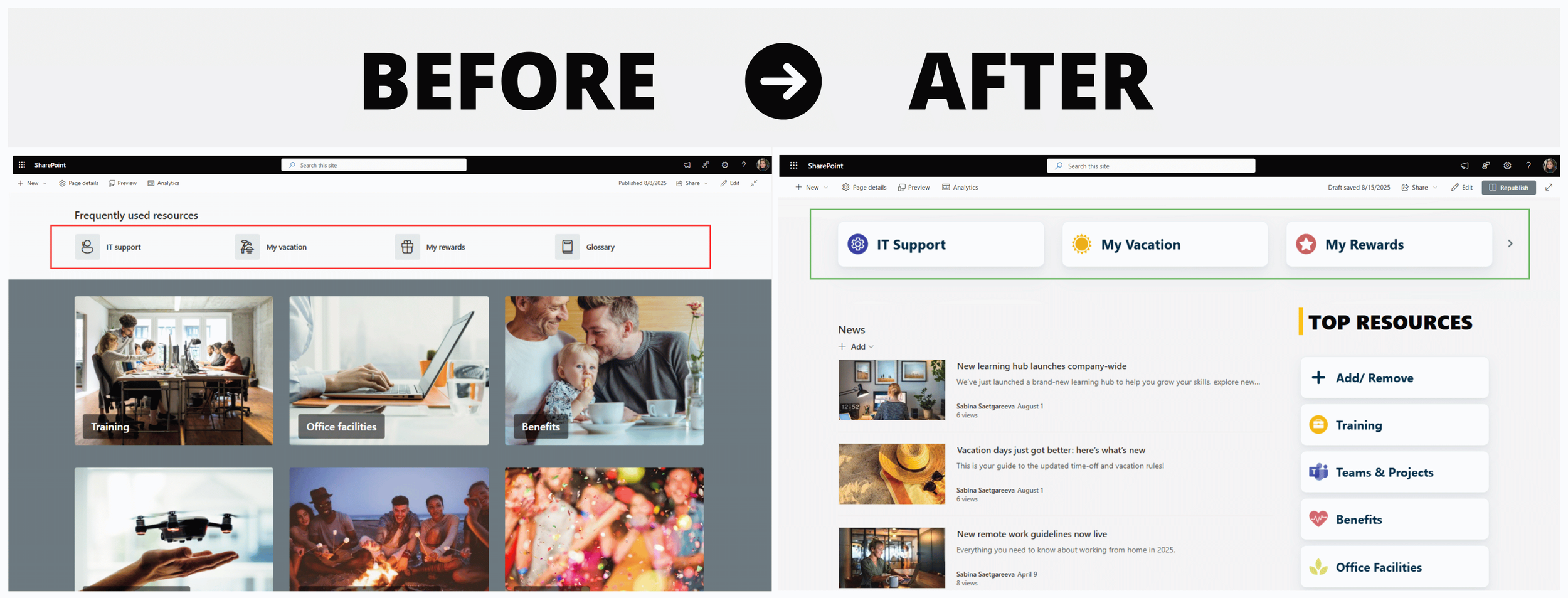
Now, the quick links are easier to find, and this section is starting to feel more put together.
Step 4: Replacing “Frequent Sites” with Bookmarks
Remember the Frequent Sites web part we kept in “Step 2”? It’s handy, but it only shows sites people have visited before, not necessarily the ones they actually need right now.
So, we swapped it out for personalized bookmarks.
Now, employees can pin their most-used sites or even external links. This makes the SharePoint homepage feel far more relevant to their daily work.
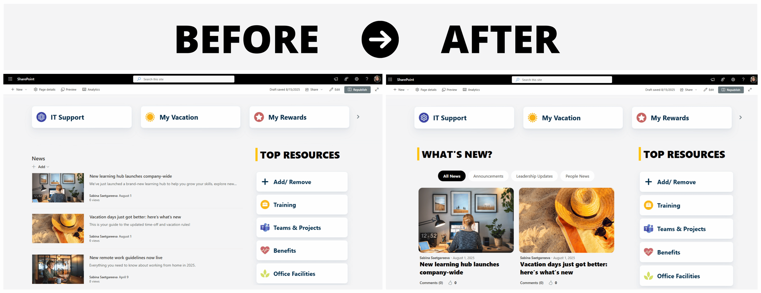
Step 5: Making SharePoint News More Engaging
The original news feed only had room for a few posts. This isn’t nearly enough for most companies where sometimes each department wants to post their own announcements.
So, we swapped out the default SharePoint News web part with Origami News Center web part, which:
Displays more news posts on a homepage at once.
Lets users switch between categories like Announcements, Leadership Updates, and People News.
Allows likes and comments for better engagement.
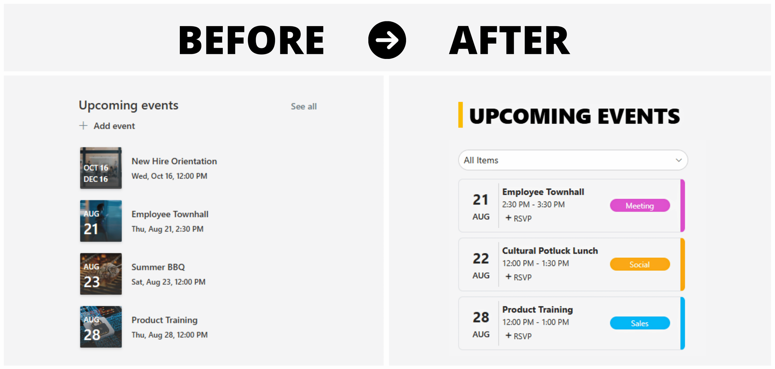
Step 6: Adding Filters to Events
Before, all events were lumped together with no way to filter them. For example, time-sensitive training could be buried under social events, and there was no RSVP option.
Now, with the Origami Calendar web part, employees can:
Filter events by category.
See them color-coded for clarity.
RSVP without leaving the SharePoint page.
It’s organized, clear, and easy to use.
Step 7: Turning a Dead Feed Into a Kudos Corner
At the bottom of the page, there was nearly empty Viva Engage feed that barely got used — mostly because no one knew what it was for. Was it a spot to share photos of weekend baking experiments? Rant about a new policy? Announce a volunteer event?
Without any direction, people either didn’t post at all, or they’d share something once and then the feed would fizzle out because it went off-topic.
So, we gave this space a real purpose and swapped the random feed for a Kudos web part.
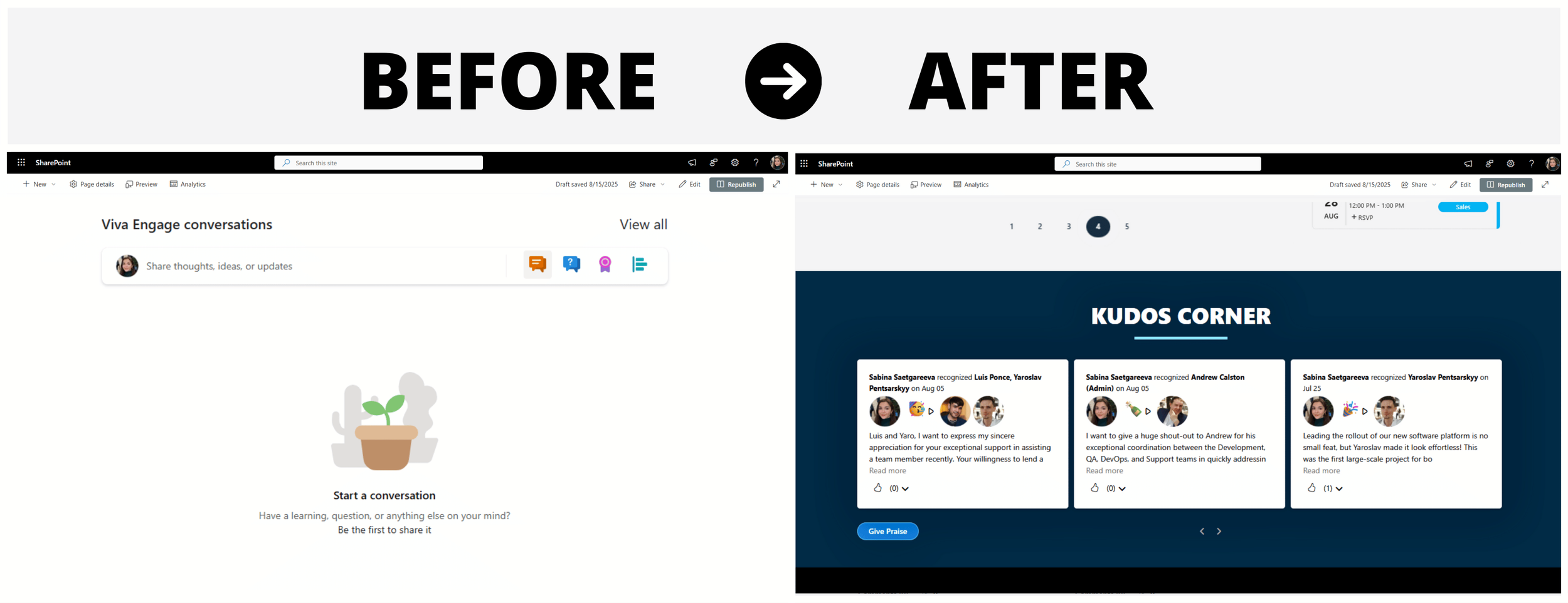
Unlike Viva Engage, which can feel vague without moderation, the Kudos corner has one clear goal: recognize and celebrate employee wins. Everyone knows what it’s for, how to join in, and it makes employees feel genuinely appreciated.
The Final Result
We went from a grey, cluttered, hard-to-navigate SharePoint homepage to a space that:
Puts important info front and center
Feels personal and on-brand
Encourages people to click, join, and engage
And you don’t need custom code or a full design team to do this. With Origami web parts and a little planning, you can build a SharePoint homepage that people want to visit every day.
Make your SharePoint INTRANET look like a website with Origami
SharePoint gives you the basics—but if you want your intranet to feel like a modern, branded website, you need more design control than it offers out of the box.
That’s where Origami adds value.
Origami is a SharePoint intranet solution that comes with ready-to-use SharePoint templates and 40+ modern web parts and design components. It installs in minutes and lets you build a clean, website-like intranet quickly. No coding or custom development needed!

And because Origami is built right on top of Microsoft’s own SharePoint framework, it stays stable, even when Microsoft rolls out updates.
So instead of fighting against SharePoint’s limitations, you can finally build an intranet that’s clean, engaging, and truly website-worthy.
Ready to make it happen?
Origami makes your SharePoint intranet look and feel like the website it was always meant to be!

Sabina Saetgareeva is a Digital Marketing Specialist at ORIGAMI. She helps infuse ORIGAMI brand with what customers need and seek. Sabina is an avid reader of the future of work, digital transformation, and trends in Digital Employee Experience.