
Many organizations search for SharePoint intranet examples because their current SharePoint homepage feels outdated, cluttered, difficult to navigate, or disconnected across multiple SharePoint sites.
The good news is that modern SharePoint Online can look dramatically better than most organizations realize.
In this article, we’ll walk through 4 real SharePoint page redesign examples showing how organizations can modernize SharePoint using:
Native SharePoint out-of-the-box features
Modern Microsoft 365 web parts
Origami SharePoint web parts for AI search and personalization
These SharePoint intranet template examples demonstrate how organizations can create more engaging employee portals, training hubs, department pages, and SharePoint communication sites without replacing Microsoft 365.
What You’ll Learn
In this SharePoint redesign guide, you’ll see:
How to modernize SharePoint pages without coding
Before-and-after SharePoint intranet examples
Differences between native SharePoint and Origami experiences
How AI search improves SharePoint usability
Modern SharePoint homepage design ideas
Examples of SharePoint training hubs and resource centers
Ways to make SharePoint Online feel more personalized and modern
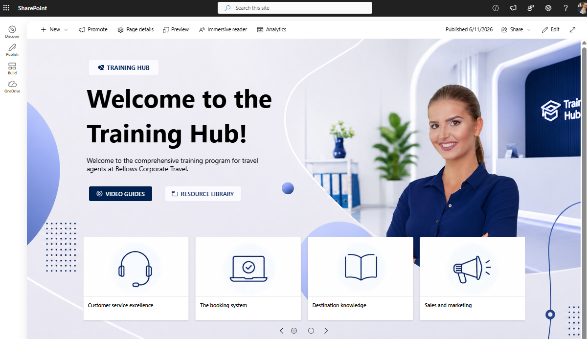
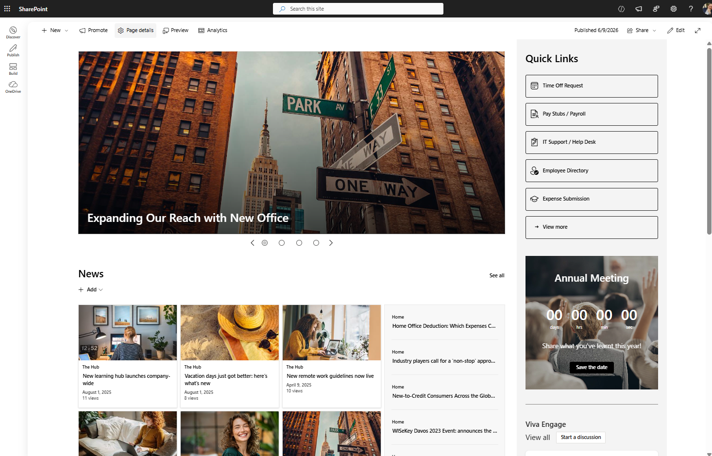
Example #1: SharePoint Training Hub Redesign
Original SharePoint Training Page
The original SharePoint training hub already looks visually modern, but the experience still behaves more like a marketing brochure than a practical employee learning portal.

SharePoint training hub built with basic SharePoint
Common issues with this type of SharePoint intranet page include:
Employees needing to scroll too far
Important actions hidden below the fold
Too much text competing for attention
Learning resources difficult to locate
Generic SharePoint layouts that feel static
This is a common issue with many default SharePoint communication site templates.
Native SharePoint Redesign (Out-of-the-Box)
Using only native SharePoint Online features, the page was redesigned into a cleaner and more practical Microsoft 365 learning hub.
SharePoint Training hub built with native SharePoint
Improvements Made
Replaced the stock image
Reduced unnecessary text
Moved learning actions higher on the page
Added clearer SharePoint quick links
Improved white space and readability
Simplified navigation structure
The redesigned SharePoint homepage instantly feels:
More modern
Easier to scan
Less cluttered
More employee-focused
Employees can now quickly:
Access training videos
Open learning resources
Navigate onboarding materials
Find important documents faster
This redesign shows how much SharePoint Online can improve using only standard Microsoft 365 functionality.
Origami SharePoint Training Hub
The Origami version transforms the experience even further.
Instead of employees searching through multiple SharePoint pages and document libraries, users can simply ask questions through an AI-powered SharePoint search experience.
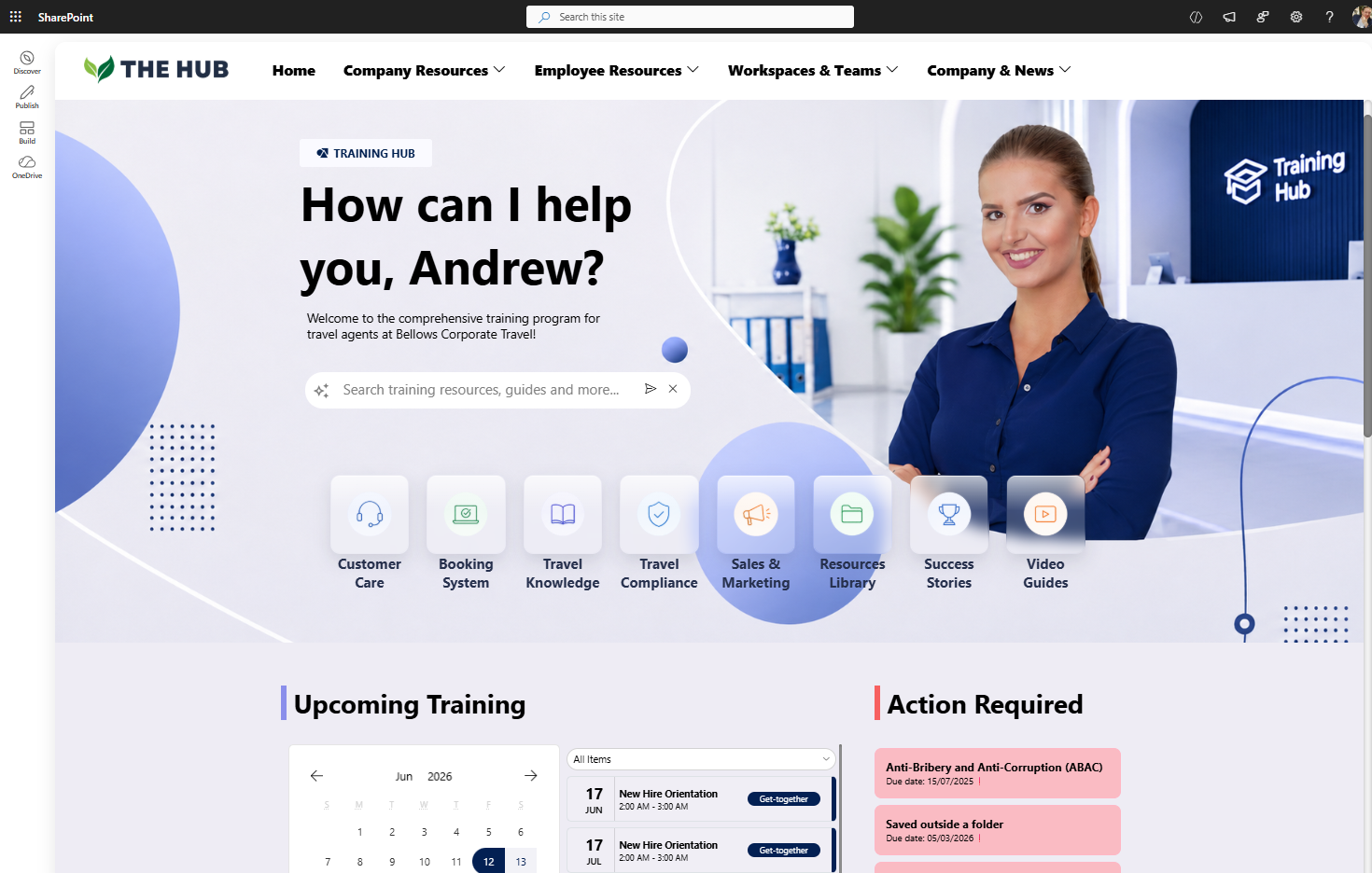
A SharePoint training hub template that organizes onboarding, required training, certifications, and learning calendars to improve employee training and compliance management.
Origami Enhancements
AI-powered SharePoint search
Personalized employee greetings
Dynamic quick links
Personalized answers from SharePoint content
Role-targeted experiences
Smart Microsoft 365 resource discovery
Employees can type questions naturally and instantly receive answers pulled from SharePoint guides, manuals, and workplace documentation.
At this point, the SharePoint intranet becomes more than a static resource page — it becomes an intelligent employee support system.
| Version | Strengths | Weaknesses |
|---|---|---|
| Original SharePoint Template | Modern visuals and a familiar SharePoint starting point. | Feels more like a brochure than a practical training hub. |
| Native SharePoint Redesign | Cleaner navigation, better readability, and improved resource access. | Limited personalization and still depends on manual page updates. |
|
Origami Origami SharePoint Experience |
AI search, personalized quick links, role-based content, and smarter learning discovery. | Requires Origami SharePoint web parts. |
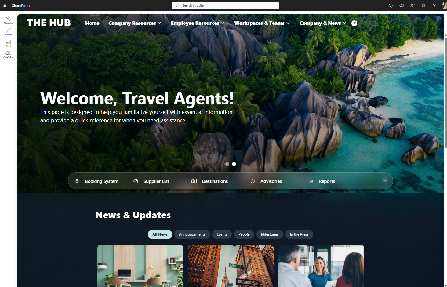
Example #2: SharePoint Resource Center Redesign
Original SharePoint Resource Page
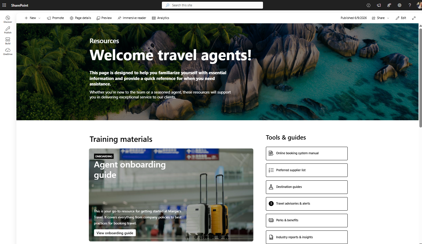
SharePoint Homepage built with basic SharePoint
Microsoft originally positions this SharePoint page template as a resource center for travel agents, but it can also function as:
SharePoint department homepage
Employee portal
Resource hub
SharePoint communication site
The original SharePoint design struggles with:
Hard-to-read text
Visual clutter
Overpowering background imagery
Poor action visibility
Weak content hierarchy
While the design looks immersive, usability suffers significantly.
Native SharePoint Homepage Redesign
Using standard SharePoint Online web parts, the page was redesigned into a cleaner and easier-to-use employee resource portal.
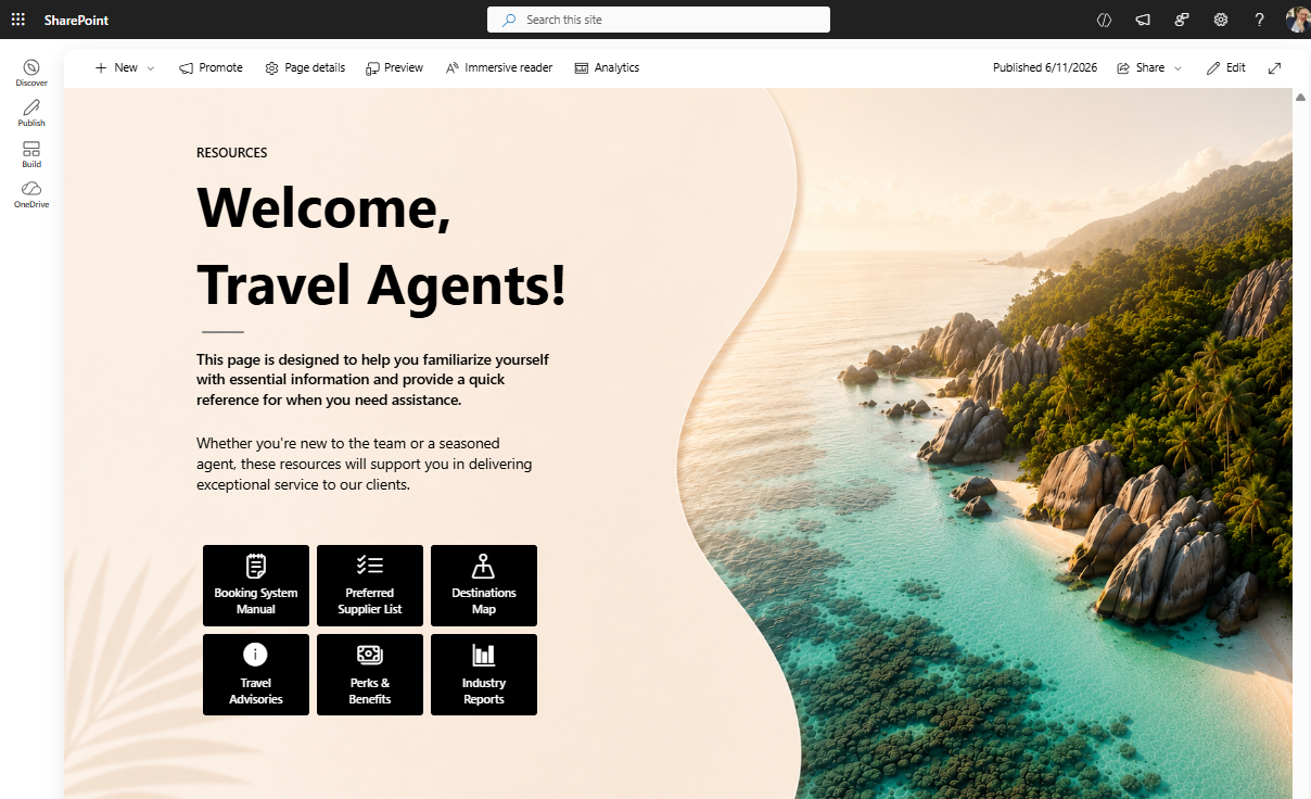
SharePoint Homepage built with native SharePoint
Key Design Improvements
Simplified the hero area
Improved typography contrast
Reduced image competition
Integrated quick links into the banner
Improved spacing and alignment
Reduced visual noise
The redesigned SharePoint intranet homepage now feels:
Cleaner
Easier to navigate
More readable
More professional
One important detail many organizations overlook is how much effort goes into creating polished SharePoint visuals using only native functionality.
A large amount of time often goes into:
Adjusting background images
Testing layouts
Aligning sections
Improving responsiveness
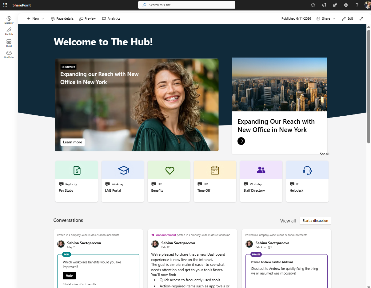
Origami SharePoint Resource Center
The Origami version achieves a significantly more premium SharePoint design with much less manual work.
Immersive dark mode SharePoint intranet template combines personalized greetings, company news, quick links, and workplace resources to create a more engaging employee experience.
Origami Features Used
Glass-style quick links
Expandable navigation
Sliding SharePoint banner carousel
Integrated top navigation
Interactive homepage layouts
Modern Microsoft 365 styling
The entire SharePoint Online homepage feels more immersive, modern, and interactive while still running fully inside SharePoint.
| Version | Strengths | Weaknesses |
|---|---|---|
| Original SharePoint Template | Visually immersive | Difficult readability |
| Native SharePoint Redesign | Cleaner and more practical | Heavy image customization effort |
|
Origami Origami SharePoint Experience |
Premium design with faster implementation | Requires Origami |
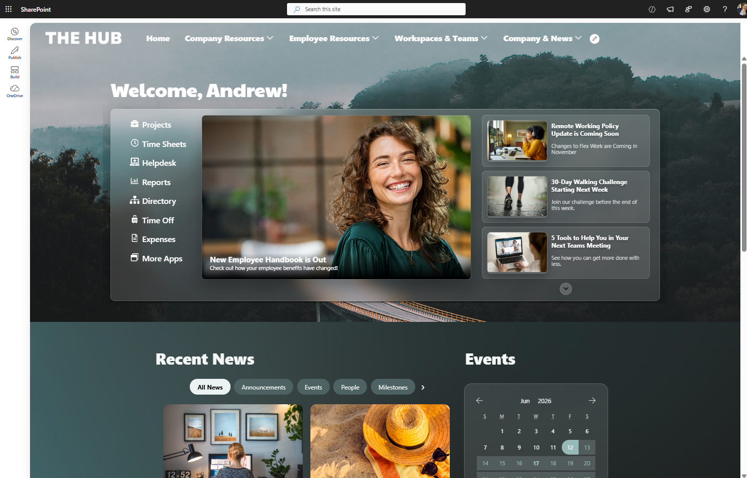
Example #3: SharePoint Welcome Hub Redesign
Original SharePoint Homepage Design
This is one of the most common SharePoint intranet homepage layouts organizations use today.
Basic SharePoint out-of-the-box homepage
Typical elements include:
Company news
SharePoint quick links
Hero banners
Department navigation
Employee announcements
While functional, the experience often feels:
Boxy
Dated
Static
Less mobile-friendly
Many traditional SharePoint Online designs also rely heavily on vertical sections that do not translate well to mobile devices.
Modern SharePoint Out-of-the-Box Redesign
Using newer SharePoint Online capabilities, the same homepage structure was redesigned using modern Microsoft 365 features.
Modern SharePoint Out-of-the-Box page used as a homepage
Modern SharePoint Features Used
Flexible Sections
Hero web part
Editorial cards
Dashboard web parts
Improved section layouts
The redesign removes much of the classic “boxy SharePoint” appearance.
The page now feels:
Cleaner
More modern
Easier to scan
Better optimized for mobile
This demonstrates how modern SharePoint communication site designs can look dramatically different from older intranet layouts.
Origami SharePoint Welcome Hub
The Origami SharePoint homepage introduces more dynamic and automated experiences.
A modern glass-style SharePoint intranet homepage using layered transparency layouts, targeted news, and employee resources to create a more visually engaging digital workplace.
Origami Features Used
Banner with News Plus
Automatic SharePoint news aggregation
Personalized homepage experiences
Dynamic Microsoft 365 content
Integrated navigation system
Automated content freshness
One major advantage is that homepage content updates automatically as new SharePoint news articles and announcements are published.
This helps organizations reduce manual homepage maintenance while improving employee engagement.
| Version | Strengths | Weaknesses |
|---|---|---|
| Original SharePoint Homepage | Functional and familiar | Outdated appearance |
| Native SharePoint Redesign | Cleaner and more mobile-friendly | Limited automation |
|
Origami Origami SharePoint Experience |
Dynamic and self-updating | Requires Origami |
Example #4: SharePoint Learning Hub Redesign
Original SharePoint Learning Page
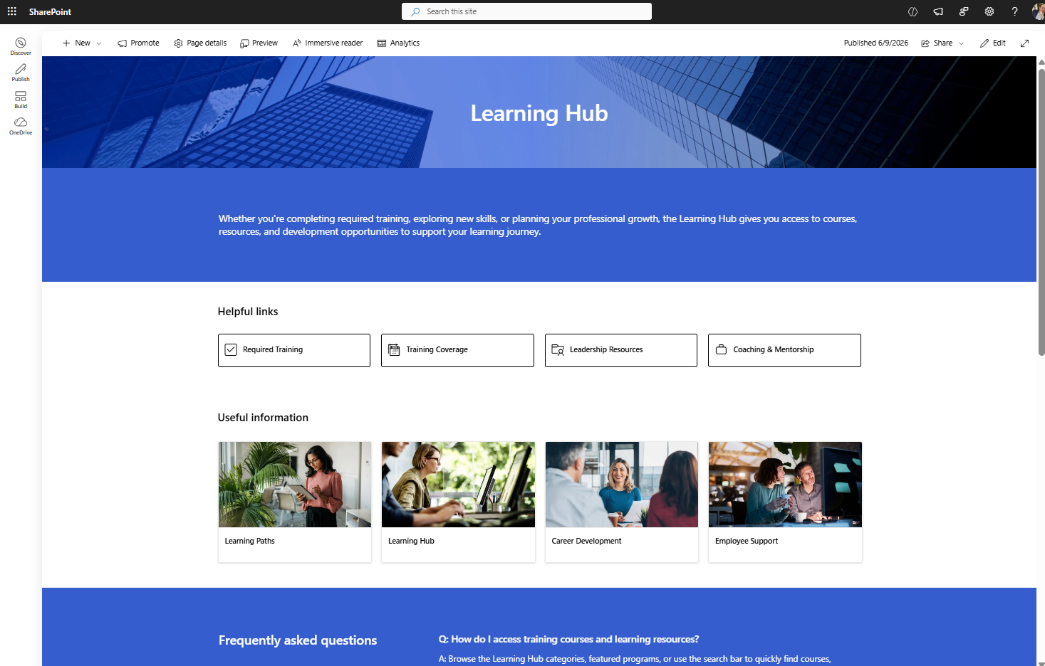
Learning page built with SharePoint out-of-the-box
The original SharePoint learning hub uses a very traditional intranet design:
Heavy blue styling
Large empty spaces
Generic layouts
Important actions placed too low
Limited personalization
The page feels static and visually outdated.
Native SharePoint Learning Hub Redesign
Using only native SharePoint Online features, the page was redesigned into a lighter and easier-to-use employee learning portal.
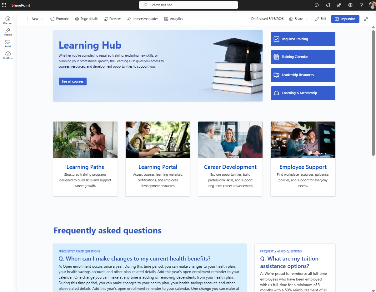
Learning page built with SharePoint out-of-the-box
Improvements Made
Reduced heavy colors
Added more white space
Moved actions higher
Improved content hierarchy
Added editorial cards
Used Flexible Sections for cleaner layouts
The redesign immediately feels:
More modern
Easier to scan
More polished
Less like a default SharePoint template
This is a strong example of how newer Microsoft 365 design capabilities can modernize older SharePoint intranet pages.
Origami SharePoint Learning Experience
The Origami version transforms the page into a personalized employee training system.
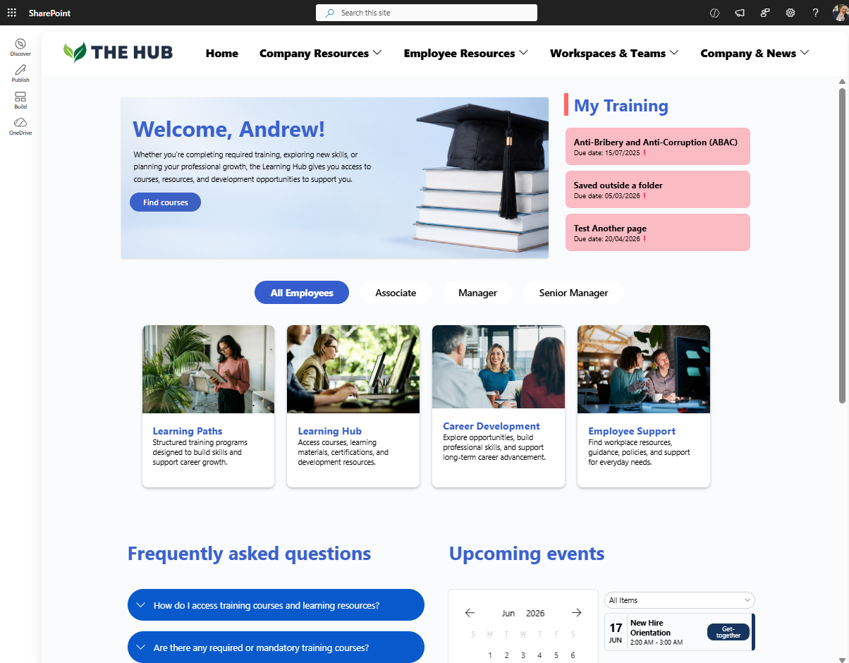
Learning Page built with Origami on SharePoint
Advanced Origami Features
Mandatory training assignments
Department-targeted learning
Automatic completion tracking
Personalized employee dashboards
Manager reporting tools
Dynamic training experiences
Managers can assign training automatically to hundreds or thousands of employees while tracking completion rates directly inside SharePoint Online.
At this point, the SharePoint page becomes much more than a static information portal — it becomes an operational employee learning system.
| Version | Strengths | Weaknesses |
|---|---|---|
| Original SharePoint Template | Functional basic layout | Generic and outdated |
| Native SharePoint Redesign | Cleaner and easier navigation | Limited automation |
|
Origami Origami SharePoint Experience |
Personalized training workflows and tracking | Requires Origami |
Final Thoughts: Modern SharePoint Can Look Much Better Than Most Organizations Realize
These before-and-after SharePoint redesign examples demonstrate an important point:
Modern SharePoint Online is capable of delivering far more polished and engaging employee experiences than many organizations expect.
Using newer Microsoft 365 capabilities, organizations can create:
Modern SharePoint intranet homepages
Employee portals
Department sites
SharePoint communication sites
Knowledge bases
Learning hubs
Resource centers
And with Origami SharePoint web parts, organizations can extend SharePoint even further with:
AI-powered SharePoint search
Personalized employee experiences
Dynamic content targeting
Automated homepage updates
Advanced navigation systems
Interactive Microsoft 365 experiences
The platform itself hasn’t changed.
What changes is how far organizations are willing to push SharePoint beyond the default experience.

Yaroslav Pentsarskyy is a Digital Workplace Advisor at ORIGAMI. Yaroslav has been awarded as Microsoft Most Valuable Professional for 8 years in a row and has authored and published 4 intranet books.
Yaroslav is also a frequent presenter at industry conferences and events, such as the Microsoft SharePoint Conference and Microsoft Ignite.